Documentation
INSTALLATION INSTRUCTIONS
1. Unzip this file in your site's packages/ directory.
2. Login to your site as an administrator.
3. Find the "Add Functionality" page in your dashboard.
4. Find this package in the list of packages awaiting installation.
5. Click the "install" button.
PAGELIST CUSTOM BLOCK TEMPLATES
Use a "Page list" block then choose the desired template under custom template
*Note: use thumbnail in custom attributes for the images (page properties -> custom attributes)
- Avenir Blog Index
- Avenir Blog Index Thumbnail
- Avenir Three Column Blog Index
- Avenir Three Column Portfolio
- Avenir Three Column Features
- Avenir Four Column Blog Index
- Avenir Four Column Portfolio
- Avenir Four Column Feature
- Avenir Carousel Portfolio
- Avenir Footer Blog Index
AUTONAV CUSTOM BLOCK TEMPLATES
Use an "Autonav" block then choose the desired template under custom template
- Calyx Dropdown
- Calyx Left Side Nav
- Calyx Right Side Nav
- Calyx Footer Nav
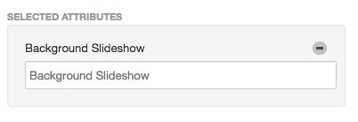
FULL SCREEN BACKGROUND
Create a file set of your images. First, go to file manager check checkbox(left-most side) of your desired images then on top select SETS

Check and add a name of your file set.

To enable Full Screen Background, Go to your home page go to page properties -> custom attributes and select Background Slideshow in the bottom part. Then input the name of your File Set.
TWEETCRETE CUSTOM BLOCK
Download "Tweetcrete", use it and choose Calyx TweetCrete under custom template
FONT AWESOME
You can check the documentation on how to use FONT AWESOME click here.
HEADLINE AND BREADCRUMBS
To enable headline and breadcrumbs go to page properties -> custom attributes and check breadcrumbs (Yes)
THEME COLOR SCHEMES
Manually go to header.php file and uncomment lines for each color scheme and don't forget to comment out the current color scheme file.
CUSTOMIZABLE COLORS/ELEMENTS
Go to dashboard->themes->customize (theme that is used/activated)
CALL TO ACTION BUTTON
How to use:
Simply add a class "cta-button" on your <a> tag. Ex. <a href="#" class="cta-button">Test Button</a>
Max Rounded button:
Simply add a class "max-rounded" on your <a> tag. Ex. <a href="#" class="cta-button max-rounded">Test Button</a>
Minimum Rounded button:
Simply add a class "min-rounded" on your <a> tag. Ex. <a href="#" class="cta-button min-rounded">Test Button</a>
Choose 4 customizable colors
1. Simply add a class "bg-color-var-1" on your <a> tag. Ex. <a href="#" class="cta-button bg-color-var-1">Test Button</a>
2. Simply add a class "bg-color-var-2" on your <a> tag. Ex. <a href="#" class="cta-button bg-color-var-2">Test Button</a>
3. Simply add a class "bg-color-var-3" on your <a> tag. Ex. <a href="#" class="cta-button bg-color-var-3">Test Button</a>
4. Simply add a class "bg-color-var-4" on your <a> tag. Ex. <a href="#" class="cta-button bg-color-var-4">Test Button</a>