WARNING: concrete5 5.6 and earlier are end-of-life. Sales from the marketplace have now ended. Click here to learn more about this transition.
FlexCRETE
 PineCreativeLabs
THEME RETIRED
This theme is no longer supported.
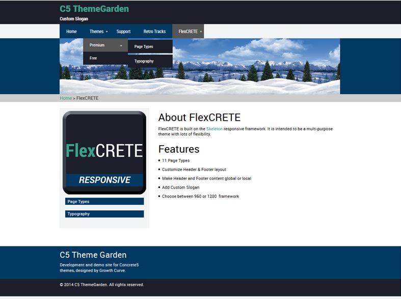
----------------------- Who says Concrete can't be flexible?This is a highly responsive theme that's based on the Skeleton CSS framework. Using only CSS, it is designed to scale your site to fit on ANY device - whether it be a smartphone, tablet, or standard monitor.
Why spend additional time developing a mobile version of your site? FlexCRETE makes it easy to build a single website that can be viewed on any mobile device or any size screen!
Scales your site to fit on:
- iPad, or other tablet device (supports both portrait and landscape orientation)
- iPhone or other smart phone device
- Any size monitor
11 Page Types
- Home
- Left Sidebar
- Right Sidebar
- Full-width
- Two Column
- Three Column
- Four Column
- Blog Entry
- Pb Post (ProBlog Post)
- Blank*
- Single-Page*
*Blank - Ideal for creating content to be loaded via ajax.
*Single-Page - Allows you to create a single-page website with anchored links.
BONUS: Includes support for these system pages:
- Login
- 404 Error (Page Not Found)
- 403 Error (Page Forbidden)
Blocks
Flex CTA (Call to Action) - Featured links to site pages!
Fit Text - Add a responsive text header that fits anywhere!
Flex Page Info - Display page title, description, author, and date published.
Custom Templates
Flex Logo (Image Block) - Ideal for displaying a logo.
Flex Image (Image Block) - Auto-fits image to fit within any area (responsive).
Flex File (File Block) - Renders download link as a button.
Flex Index (Page List) - Renders page list as a single-column index list. Displays "Flexcrete Featured Image" page attribute, and keywords.
Configuration Options
Includes a configuration panel and documentation area in dashboard!
- Add a custom slogan
- Show or hide Navbar, Breadcrumb bar, and "Sticky" Footer
- Select layout for Header and Footer
- Option to make header and footer content global or local
- Choose 960 or 1200 framework
- Customize layout for 404 and 403 pages
-
 Screenshots
 -
 Video
Video
-
 Live Demo
-
 Used On Sites
Our 30 Day Support Policy
- Replies to tickets every few days.
Support Hosted
- On marketplace.concretecms.com